2017 was a year defined by people leaning in. It was marked by debate on diversity, inclusivity, and sexism, from the sterile halls of Silicon Valley to the studios of the entertainment industry, and across the political spectrum.
So, what does this have to do with design? Everything, really.
Design is a reflection of our society and an indicator of where we are as a culture. What we see from brands in magazines, on our Facebook feeds, and on websites, often mirrors the world in which we live.
That’s also why design has the power to inform.
Remember the controversy around Facebook’s friends icon? A woman standing in the shadow of her male counterpart? Caitlin Winner, the Facebook designer responsible for the redesign explained,
“As a woman, educated at a women’s college, it was hard not to read into the symbolism of the current icon; the woman was quite literally in the shadow of the man, she was not in a position to lean in.”

Facebook friends icon redesign by Caitlin Winner
On the decision to use a “brown hand” in Slack’s “Add to Slack” update, designer Diógenes Brito wrote:
“Why was the choice an important one, and why did it matter to the people of color who saw it? The simple answer is that they rarely see something like that. These people saw the image and immediately noticed how unusual it was. They were appreciative of being represented in a world where American media has the bad habit of portraying white people as the default, and everyone else as deviations from the norm.”
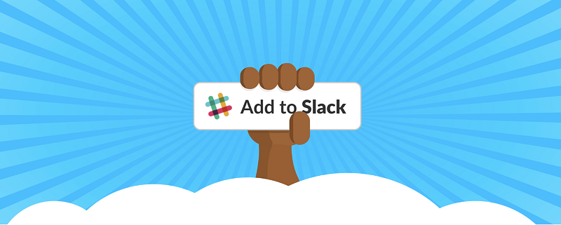
“Add to Slack” concept by Diógenes Brito
This past year, illustrator Alice Lee released her views on the project of creating WordPress.com’s brand illustrations and her journey to “democratize publishing” in the aptly titled, Inclusiveness in Illustration.
She outlined a design system embracing the full spectrum of real people interacting with a global product; a process that included discussions on subjects such as body type and how to design for gender fluidity.
“So, how can inclusion and representation be expressed through character design and illustration voice? When you begin with these principles as cornerstones of your brand, rather than tacking them on at the end, they manifest in the design process in straightforward and thoughtful ways.”
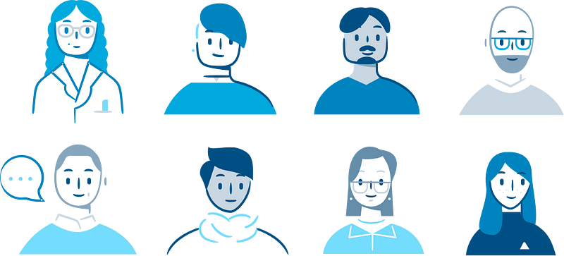
Inclusiveness in illustration, by Alice Lee
Other interesting initiatives were pursued on the organizational level by major companies proactively creating inclusive teams, processes, and methodologies: Airbnb launched a toolkit for designing inclusive experiences while Microsoft announced a framework for Inclusiveness in Design.
Inclusive Design at Microsoft
Yet, despite these advances, it’s clear our mirrors still reflect a homogenous digital environment.
Some point to lack of diversity in design (see: AIGA’s design census, or Ekene Ijeoma’s project, “The Ethnic Filter” ) while others may point to leadership within organizations. Even designers that would like to implement more inclusive materials run into barriers — creating high-quality custom content is expensive (really expensive!), and sourcing images that aren’t overwhelmingly white is pretty difficult.
So what does this mean for the state of design in society? We’d like to think that the progress already made by designers like Caillin, Diógenes, Ekene, and Alice, combined with the fever pitch in the discussion around these issues, served as a wakeup call to our community. Early indications are positive.
The most interesting trend we’ve observed this past year, examining some of the biggest brand updates and redesigns in 2017, is an increase in the use of illustration in web design in what we’d like to think (or hope) is in the pursuit of greater diversity and inclusion.
Here’s a deeper look at the brands putting inclusivity front and center:
1. Asana
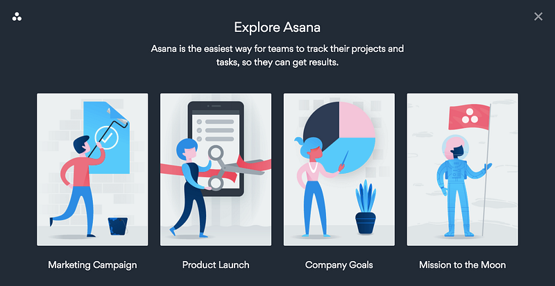
Illustration by Nick Slater, Design by Zach Miller & Matt Riley
While Asana’s major rebrand happened back in 2015, they’ve been quietly rolling out a new marketing site (and ads framework) over the past year. We’re seeing greater use of white space, a more subdued color palette, and forward-thinking editorial-style illustration in highlighting product use cases.
2. Slack
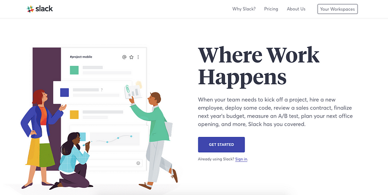
Illustration by Alice Lee, Art direction from Brandon Velestuk & Kristy Tillman
Arguably one of the most-hyped redesigns of the year was Slack. In collaboration with Ueno, the Slack design team and illustrator, Alice Lee, were able to create a concise, engaging, inclusive experience that directly speaks to their mission of creating alignment and shared understanding across your team, making you more productive, less stressed, and just a little bit happier.
3. Headspace
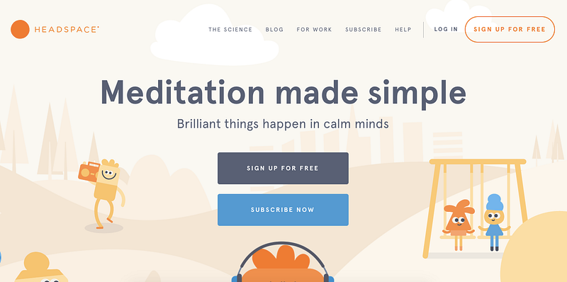
Design & Illustration by Chris Markland, Art direction by Anna Charity
This redesign was one of the most significant and extensive we’ve seen so far in 2017. The visual language that they developed is fresh, charming, invigorating, succinct, and unique. Moreover, it’s inclusive, representative of a range of people from all walks of life.
We loved their soothing color palette, flat illustration style and subtle use of parallax scrolling on their marketing homepage bringing their whole imaginary world to life.
4. Gusto
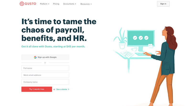
Illustration by Camellia Neri, Design by Natalie Schoch
Gusto unveiled their brand new marketing site back in September. The result was a 180 departure from an image-centric hero section and heavy use of the grid.
White space, larger fonts, less text, and beautiful illustrations, characterize their their new look and feel. The site is sprinkled with thoughtful, tasteful nods to the diversity found amongst small business owners and highlights their mission of empowering a better life.
5. Evernote
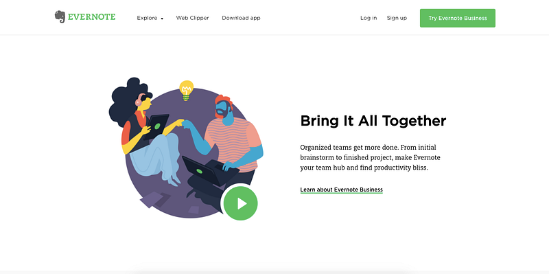
Illustrations by Carlos Rocafort
While the biggest news around Evernote in terms of design was their iOS update, another under-the-radar update was a pretty big shift in the visual language and layout of their marketing website. The “clean” aesthetic of the app is clearly visible on the page which almost mimics a black page with notes in terms of style.
The illustration work is not only beautiful and diverse, but it’s also functional, serving as the vehicle for short marketing movies. Everything about this refresh makes more sense in terms of telling the Evernote story of having your best ideas always with you and always in sync.
A few other examples of illustration in web design highlighting inclusivity that stood out in 2017:
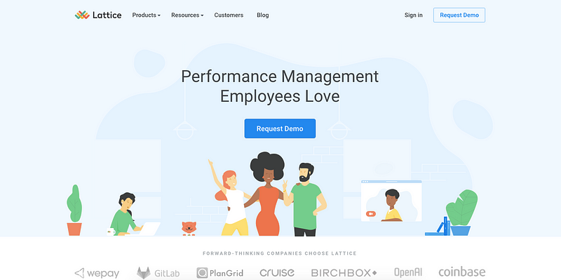
Lattice
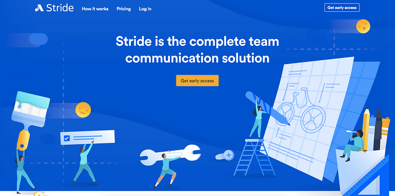
Stride
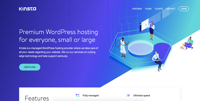
Kinsta
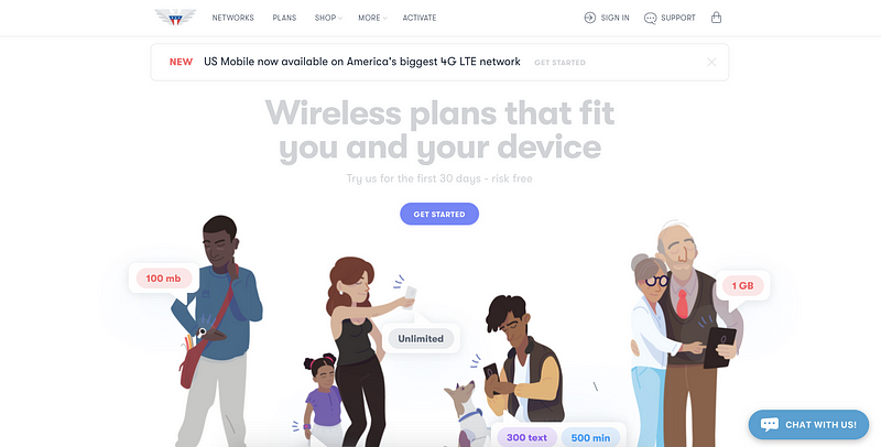
US Mobile
What to expect in 2018? More inclusivity in visual communication and user experience
The way in which we view the world isn’t simply inherited nor is it static – it’s something that develops and evolves over time, affected by our choices each and every day.
Years like this – where biases are put front and center serve as a reminder for us to check in and evaluate our own personal lens to become more inclusive and accepting.
“Going forward, it won’t be enough to design for some people, or even for most. The real challenge will be to design for all” (Co.Design)
2017, for better or for worse, certainly served as an awakening to us all.