It was June 25, 2019, just 2 weeks away from one of the biggest days of the year at Lemonade: Giveback Day, where our community donates unclaimed premiums to charity.
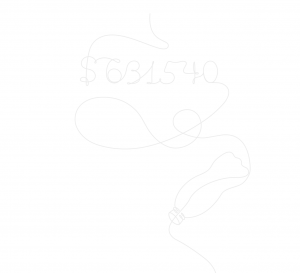
This year, our impact was BIG. Like, $631,540 big (growing more than 1000% since the first Giveback in 2017). So our announcement had to be big, too.
But we didn’t have much time. We calculated the final numbers on June 30th, and planned to announce our massive impact just 2 weeks later. Which meant no bandwidth to build specs and hold design workshops.
So we decided to make the Giveback announcement a Secret Project: Lemonade lingo for an out-of-the-ordinary project where all typical rules go out the window.
And that just might have been its secret to success.
The kickoff
When it came time for the kickoff meeting, we gathered a small creative team, and started throwing around ideas for our Giveback announcement.
All we knew at that moment was our objective: To have as many people as possible know that $631,540 was donated to 25 charities by our Lemonade community.
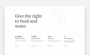
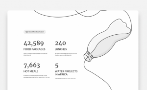
But that wasn’t all. We also wanted our customers to understand the meaningful impact those dollars had on all 25 charities – from the 5 water projects that were built with charity: water to the 1,683 LGBTQ+ youth who received life-saving intervention with The Trevor Project.
We agreed that a landing page on our site would be the best medium, since we had a lot that we wanted to say, and shareable images just wouldn’t cut it. And in typical Lemonade fashion, it needed to be designed beautifully.
So the looming question was: How could we communicate the big number, along with the 25 resulting impacts, in a simple, intuitive, engaging, and attractive way?
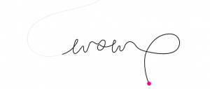
As the team shot around design concepts while noting our time crunch, an idea emerged: To repurpose the line art style we use on Facebook ads to tell the Giveback story.
Why this style? It allows for infinite ways to illustrate the impact of Giveback and the connectivity between each charity. We could illustrate an image representing LGBTQ+ support, and connect it to another image capturing food and water – showcasing that all of these charities are connected under the Giveback umbrella.
But how could we adjust the line art style to fit a webpage, in a way that would draw the user in and compel them to continue scrolling?
We needed to make it interactive and immersive, while piquing the user’s curiosity. So we decided to design the line to unravel as the user scrolls, and make it both playful and intriguing enough to encourage the user to stay on the page.
But we still had more questions than we came into the meeting with: How could we bring life to the page in a way that helps us tell a story? How could we make the layout simple and intuitive enough so the user could understand the impact?
Creating the proof of concept
With just 6 days to create a proof of concept, Lemonade’s designers and one of our front-end developers worked in tandem to create and develop the layout, design, and illustrations. Here’s a breakdown of how it happened:
Layout & Design
The first step was creating a rough layout of how the page would look on a screen. The design needed to be interactive, work on desktop and mobile, and use the line art to communicate our message.
Our illustrator created a sketch of how the line drawing would look throughout the page, using Adobe Illustrator:
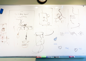
Meanwhile a product designer sketched a few concepts on a whiteboard. It was messy and rough, to say the least – there was no need (or time) to make the process perfect.
The designers decided that the main composition of the page would have a very long line going from the beginning of the page until the end, tracing the user through different impact sections and animating as the user scrolls. Each impact section would be comprised of an illustration created by the line, and boxes of text.
When the designers shared the concept with the front-end developer, he understood immediately how to make it come into fruition, thanks to his background in game development and animation. He created a mockup of the line that draws with you as you scroll, using SVG animations and CSS.
Next, two product designers worked on the details of the layout and typography. As they built concepts for the impact section, they made sure to maintain our brand look throughout. They ensured that the shapes we used were round and dimensional, similar to the rest of our design. They also maintained our limitation of color, only using grey, pink, and white.
They had several mockups that didn’t make the cut, since they were too cluttered and not simplistic enough:
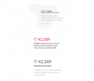
So they decided to make the impacts monochromatic with no logo, to minimize distractions and encourage the users to focus on the numbers.
When creating the layout for the cause section of the page, they initially created a big title, and put the charity name and donation amount below each impact:
But they realized that the title and impact numbers would compete for the users’ attention, and the numbers themselves needed to be front and center. They decided to make the titles much smaller and condense the description into one part, rather than two:
Illustrations
In addition to the layout, the team had to create illustrations for each ‘cause’ section – like mental health support and LGBTQ+ equality.
Before our illustrator created the illustrations, she started off by teaching herself the line art drawing technique. “People sent me links to artists who created similar illustrations, for inspiration, but I decided to limit myself from looking at their work,” she said. “This illustration technique was new for me, and I wanted this process to be rough and experimental. I wanted to look at it from my fresh perspective.”
She started out by drawing an illustration with a lot of detail, as if she wasn’t using the line art style. Then, she added another layer on top with a more simplistic illustration. And on top of that, she found the optimal path for the single line.
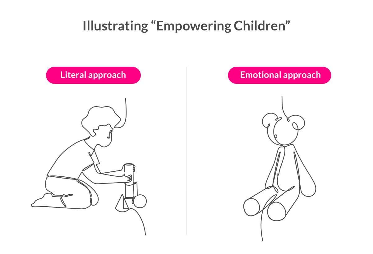
Her biggest challenge was choosing what to illustrate for each category. For the ‘children’s education’ section, she first created an illustration of a child playing with a toy. But she needed to dig deeper: What represented children on an emotional level?
A teddy bear popped into her head, as it elicits feelings of nostalgia.
The regroup
After days of hard work, the Secret Project team regrouped. With less than a week left until production, there wasn’t much room for iteration. The team had to focus only on the glaring issues, and implement small changes. But this may have been one of the reasons the page was so successful– the time crunch called for simplicity and efficiency.
They decided to add a few more surprising elements to the page to improve the user’s experience and further the Giveback story.
They wanted to draw more attention to the impressive numbers – like the fact that the Lemonade community gave more than 40,000 food packages to malnourished children, and over 7,000 hot meals to elderly New Yorkers.
So the team decided to have the numbers increase as the users scroll, to continue the concept of slowly unraveling the story. This would also add to the element of curiosity, as the user wouldn’t be able to see the full impact until they continue scrolling down.
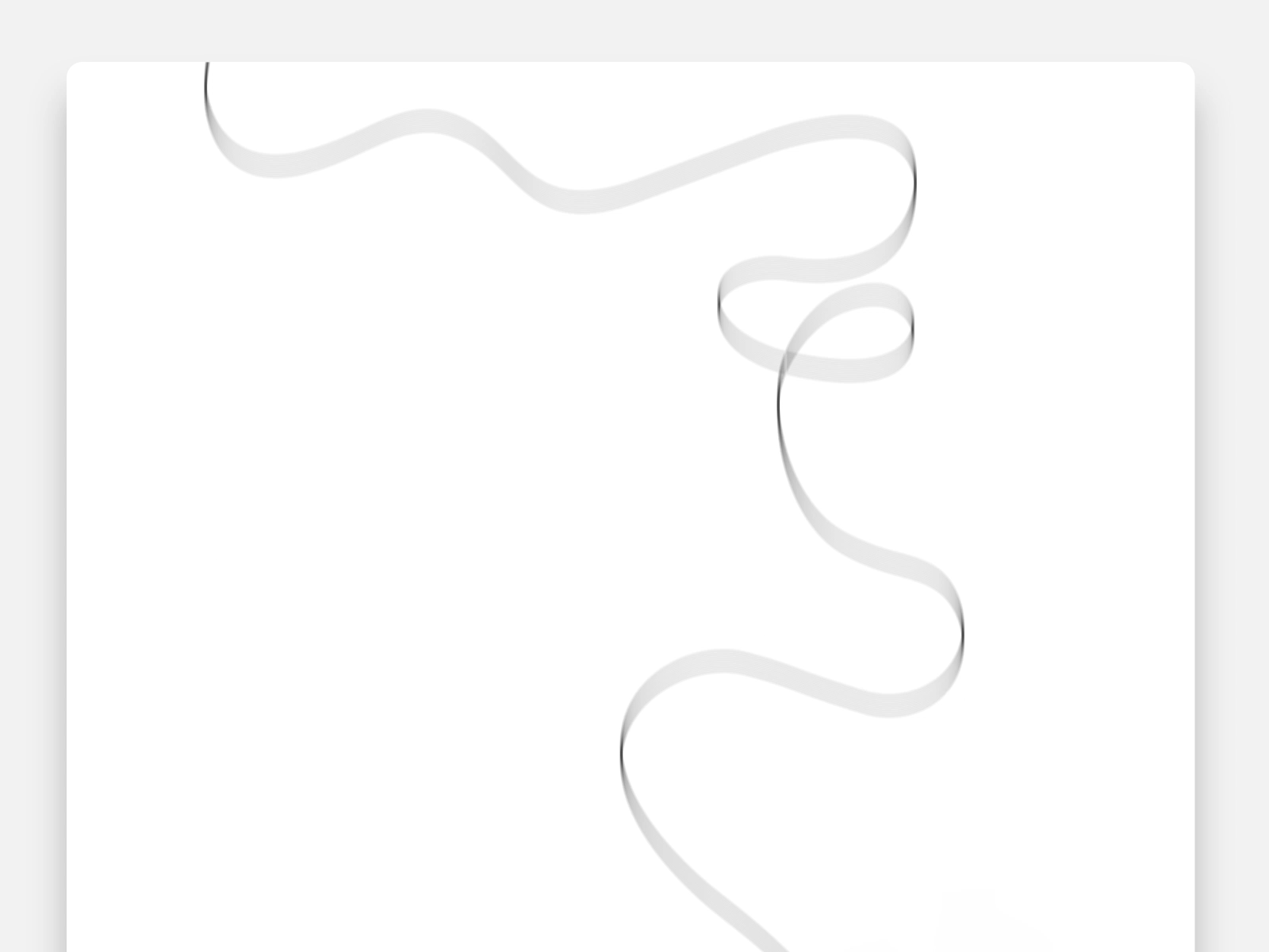
They also decided to add some small touches to make the line live, breathe, and dance, such as playful movement in between the cause sections. Adding personality to the line would crank up the fun, and attract the user more to the Giveback story.
The launch
Predictably, the last few days before launch were a bit hectic. The designers adjusted illustrations and the front-end developer updated the code until the last minute. They didn’t settle on anything. If something wasn’t pixel perfect, they fixed it, even if there were just hours left until launch.
And when it came time to launch the page on Giveback Day, excitement reverberated across the Lemonade offices – from Tel Aviv to Amsterdam to New York to Scottsdale.
The 2019 Giveback page was a loudspeaker to celebrate the impact the Lemonade community made – supporting 224,000 low-income students through Teach for America, distributing 42,589 packets of food to malnourished children with UNICEF, helping fund the ACLU’s fight in court to reunite immigrant families, and so, so much more.
With each page view, share, and award, we were able to spread the message that giving back as a company is beautiful, meaningful, and essential.
Key takeaways
Creating a CSS Design award-winning page in just 2 weeks is no easy feat, and our Giveback Page team came out of this project with a few key lessons learned:
1. You don’t need to reinvent the wheel to be innovative. Adapting a design we used on another medium helped us save time in coming up with an entirely new concept, and allowed us to come up with something creative and unique without needing to start from scratch.
2. Small, delightful tweaks make the biggest difference. The beauty of the page was in the small details- from the playful elements in between each impact section to the increasing numbers as the user scrolls.
3. Crazy time restrictions doesn’t need to mean imperfection. In fact, working in survival mode on a time crunch incentivizes teams to avoid inefficiencies, work smart, and stick to a simple approach.
4. Disrupting the day-to-day routine brings big value. The lack of structure gave the team physical and psychological permission to think crazy, and come up with new and different ideas that wouldn’t normally come up in a typical day-to-day, thanks to the magic of Secret Projects.