
When we set out to add the fifth insurance product to our offerings-Lemonade Car-we expected a lot from its landing page. The design would have to strike a delicate balance between the look and feel of the existing Lemonade experience, while also leaving room to develop a new identity for the product.
From a technical perspective, we needed something that was super performant, supported on all browsers, and simple to maintain.
We built a solution using React, with specific features constructed in Adobe After Effects and exported as Lottie animations. This was dynamic, fulfilled all of our technical criteria, and also allowed for an exciting interactive gameplay element embedded within the landing page.
Let’s take a look at some of the considerations that informed the design process.
What was our agenda?
First things first: What mood and message where we trying to convey here?
For Lemonade Car, the underlying idea was simple: You’re driving, with the Lemonade app along for this little journey. It’s nothing overly dramatic or grandiose-you’re just taking a ride to get from point A to point B. It’s less “Matthew McConaughey in a Lincoln commercial” and more “average person on an unpretentious afternoon cruise.”
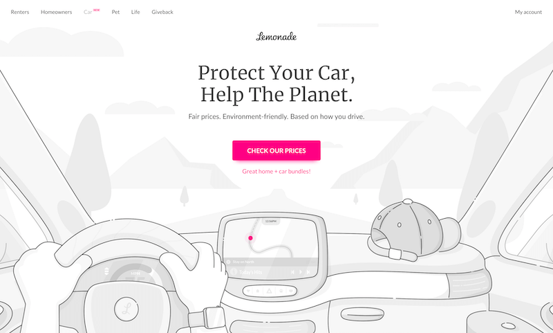
We wanted the car itself to take center stage. Sure, you’d see the anonymous driver’s hands, but that’s all-allowing the landing page visitor to imagine themselves in the driver’s seat. This also meant we could treat the car’s interior like a blank canvas, adding elements to convey small dashes of personality and color.
Fun fact, for those counting: Most Lemonade humans take a nod from The Simpsons, and only have four fingers on each hand. Our Lemonade Car driver is our first humanoid to have a full set of five.
Envisioning the ideal car
Building a car’s dashboard from scratch was exciting, but also daunting. This one automobile interior would be representing the archetypal “Lemonade driver” on the landing page. It needed to have universal appeal while also retaining a distinct personality.
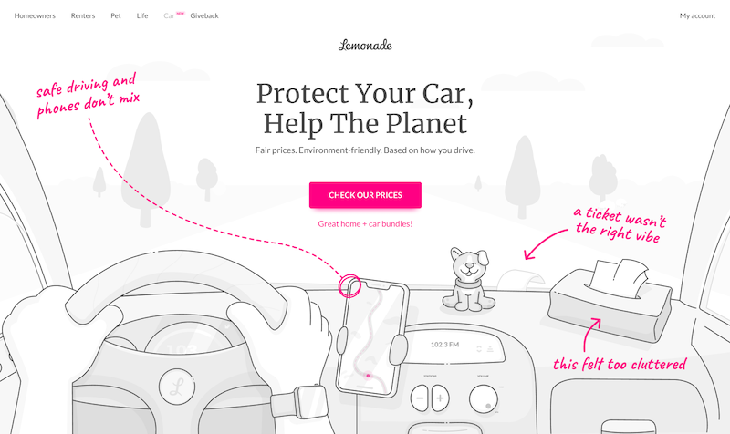
Initially, we may have gone a bit overboard in the “personality” department. (This is why we always iterate, and iterate… and iterate.) For instance, we thought it’d be fun to stick a Bobblehead-style dog on the dashboard, a visual callback to some of the existing illustrations we use for Lemonade Pet. Ultimately, we decided that this was more of an indulgence for ourselves, not the customer, and we nixed it.
In an attempt to make our fictional driver relatable, we cluttered the car’s interior with the kind of junk you might accumulate on a road trip-like an empty bag of chips on the passenger seat. One early design featured a parking ticket tucked beneath the windshield wipers.
While these were all fun touches, they weren’t quite right. Lemonade Car is a tech-powered product-the entire experience relies on driving with our app enabled, which allows us to price policies based on how you actually drive. “Empty potato chip bag and parking ticket” didn’t really capture that cutting-edge mood, and so it was back to the virtual drawing board.
It’s important to show restraint sometimes, and not include every element simply because it amuses you. The better questions are: Will it amuse the user? And will it convey the right message?
“Sir, I’m not stealing your car, I’m just taking some pictures for my job”
Throughout this process, our team members found themselves fixated on car interiors wherever they went. Some of us would even snap pictures of random interiors to share, visual inspirations that could later be Frankensteined together into a composite vehicle that was truly “Lemonade.” We obsessed over door panels, side mirrors, and center consoles. (Thankfully, no one ever thought we were trying to break into their car.)
An early iteration of our dashboard illustration had a cell phone mounted to the console. But this isn’t really how most people engage with GPS these days-and putting the phone in such a prominent spot introduced other difficulties, since safe driving and phones don’t mix.
At the other end of the spectrum is the fancy, larger-scale screen familiar to Tesla drivers. But not everyone drives a Tesla. We wanted our car’s interior to be slightly aspirational, but still relatable. Lemonade Car is for everyone, not just those who can afford a high-end electric vehicle.
In the end, we settled on a compromise: A fairly modest screen showing the driver’s route, with their car’s location highlighted in Lemonade pink (hex code #FF0083).
As for the items ornamenting the dashboard, we abandoned Bobbleheads, chip bags, and parking tickets and went with a simple item that most people have in their closet or on their coat rack: a humble baseball cap.
Of course, the dashboard is a flexible canvas, and we can potentially tweak it in the future to accommodate or nod to certain holidays or special moments in a subtle and discrete way. This is something we’ve done in the past with other Lemonade LPs for occasions like Pride month.
Hitting the (virtual) road
Of course, our car had to be moving through an actual environment-it wouldn’t just be floating in space. Figuring out what kind of environment that should be involved some technical limitations as well as thinking about the story we were actually telling on the landing page.
At first, we tried modeling the scenery on the suburban town of Bexley, Ohio (population 13,805, a suburb of Columbus, and the childhood home of one of our colleagues). Bexley’s streets are idyllic, with tree canopies stretching over the roads; we took virtual “drives” through the village using Google Street View.

The rendering got a bit complicated, though, so we said goodbye to Bexley. Later iterations involved a mix of trees and houses whizzing past the car, but nothing really hit the way we wanted it to. Either the 3D rendering would get too heavy, or the actual procession of scenery started to look too monotonous.
In the end, we settled on a simple, natural scene: A mix of small trees; a winding road; soaring mountains in the distance. It was peaceful, relatively chill, and mildly hypnotic.
Not so fast…
Let’s get into some of the technical hurdles we had to keep in mind, since it’s not always feasible to build exactly what you dream up.
Our design solution for the hero section of the landing page needed to fulfill three chief criteria:
Super performant
60 frames-per-second, ensuring a smooth, high-def viewing experience.
Supported by all browsers
Nearly 60% of all traffic to our product landing pages comes through mobile, so the landing page experience had to be seamless and consistent across platforms.
Easy to implement & maintain
The Car landing page needed to be developed quickly while still looking spectacular and meeting our standards for engineering excellence. We needed the ability to update it as we went along, keeping it looking fresh.
How we built it
Our first attempts with a naive CSS solution for the landing page hero section were fairly pared down and basic, all in greyscale. It had speed and energy as the “car” zoomed down a straight road, with mountains on the horizon.
It was highly performant, super easy to maintain, and ran well on all browsers. There was only one big hitch: The interface was boring and repetitive, and it didn’t fit with Lemonade’s existing visual language.
At this point, a member of our team rediscovered the simple and playful Javascript Racer game, by Jake Gordon, which spurred further thoughts.
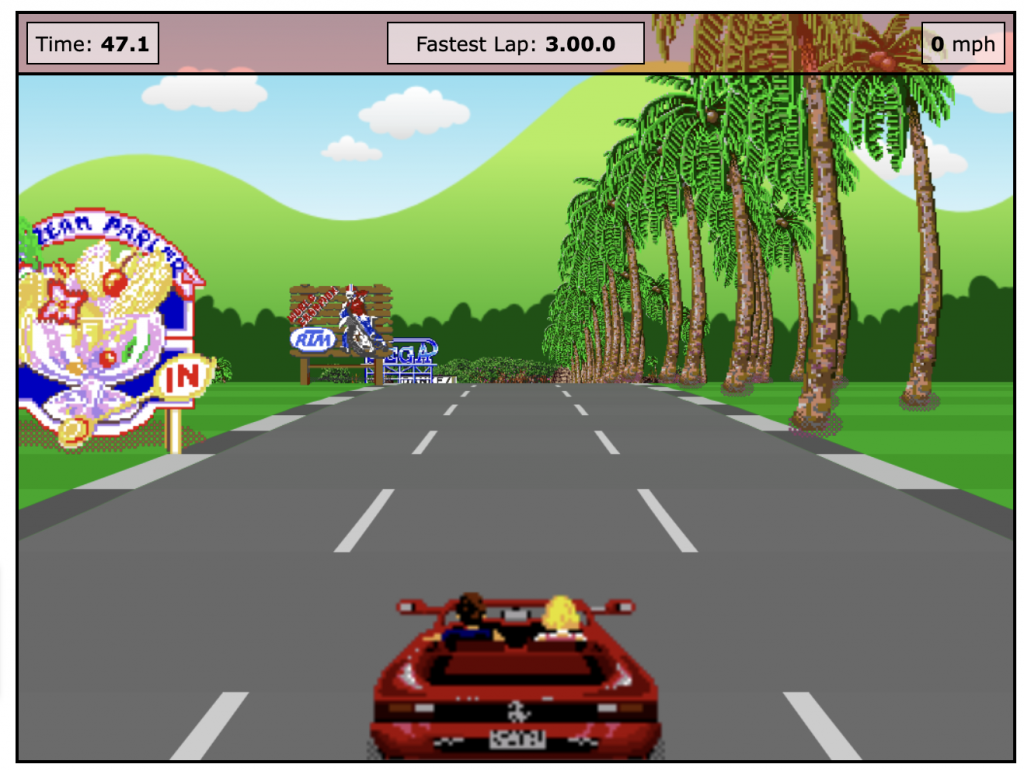
“Javascript Racer uses a well-known concept called ‘game loop,'” explains Frontend Tech Lead Elad Bezalel. “Essentially, this lets you unbind the render mechanism from the game state-and by doing so, enable max performance on the device you’re using (aiming for 60 fps, in our case). And by rewriting Gordon’s code, we broke it down and were able to run it within React.”
The game loop is composed of three distinct parts, with the whole cycle happening 60 times per second in order to ensure a smooth user experience:
- Process input (how user input affects the elements).
- Update elements’ properties according to the game logic (moving cars, speed of our car, etc.)
- Render (clear screen and render based on last changes).
React also powers a special, hidden game component within the hero section of the landing page. (Take a close look at the buttons on the GPS dashboard and poke around a bit.) While previous Lemonade LPs have playful animations, this is the first time we’ve had a fully interactive experience.
We were able to reuse React components we already had, like the car’s dashboard speed gauge.
Plus, we were able to build animations in Adobe After Effects-including the way the driver’s hands move on the steering wheel as you turn to pick up pink or green dots-and export them as Lottie animations.
How does the trip end?
In a way, each Lemonade landing page tells a story that has a beginning, a middle, and an end. Consider the LP for Lemonade’s term life offering: You see parents lovingly tossing their daughter in the air and catching her as she falls; at the bottom of the page, she’s tucked safely into bed.
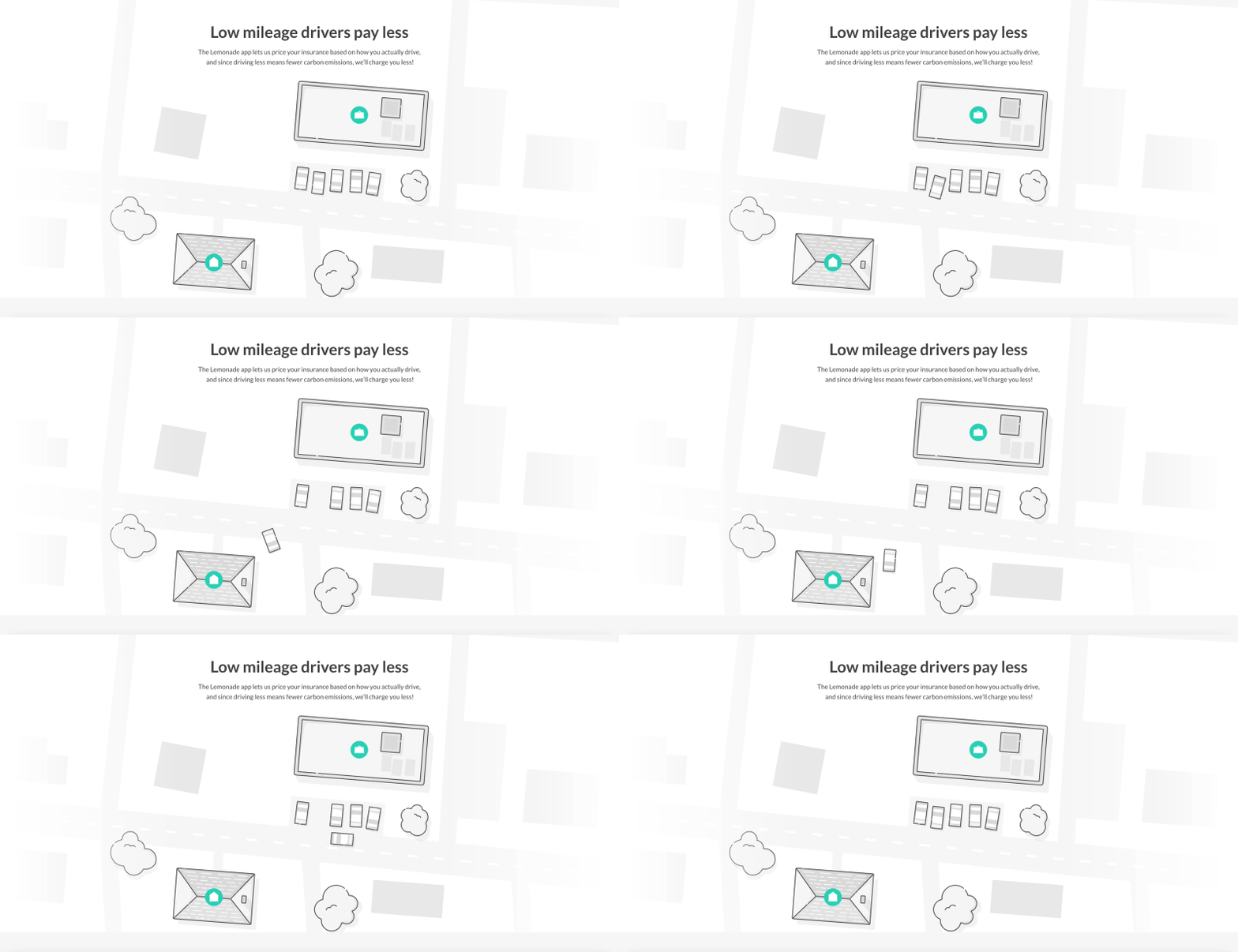
In the case of Lemonade Car, we begin with the animated driver’s seat perspective, and then proceed to address key points about the product-like how we reward low-mileage drivers, and plant trees to help clean up after carbon emissions.
But what about the landing page’s footer, which would conclude the story we were telling about Lemonade Car? Initially, we were excited about a version that showed a bearded mechanic working on a car in a darkened garage. The illustration also called back to the footer of the Lemonade Life LP, which likewise showed a dimly lit space illuminated by a glowing pink CTA.
The issue with our mechanic footer, though, was that it focused the user’s attention on what could go wrong along the way-the idyllic drive in the hero section ends with a breakdown and a visit to the garage.
Of course, car insurance is meant to protect you and your vehicle if you’re in an accident. But it felt slightly wrong to end this narrative here, especially given our previous goals:
- Present driving as something simple, enjoyable, and uncomplicated-a necessary activity, and nothing too dramatic.
- Lemonade Car is committed to environmental responsibility: through EV and hybrid discounts, tree-planting initiatives, and Giveback, which is at the heart of how Lemonade works. When you get your first policy, you choose a cause you care about, and Lemonade donates to nonprofits supporting those causes.
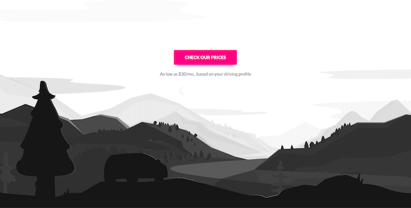
The final footer, pictured above, allowed for the same dramatic color contrasts-we’re clearly at the end of the day here, with the sun starting to set over the mountains. But instead of ending up at the auto mechanic’s, our driver is parked on a small rise, taking a minute to take in the view.
Some extra odds & ends…
If you’re still reading, we’re going to assume we’re kindred spirits-and that you like to geek out as much as we do about small tweaks to every last icon and CTA.
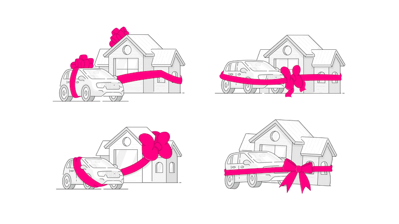
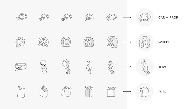
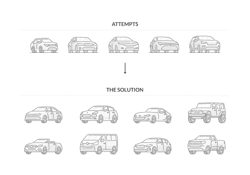
As a bonus, here are some of the many iterations we went through along the way as we workshopped how our LP (and other aspects of the product) would visualize important factors like bundling, as well as icons that would illustrate everything from car theft to so-called “acts of God.”
